NEW: Cannon et Ball paints
February 2, 2011
We’ve entertained ourselves with pretentious paint names before on HomeShoppingSpy. Ah, how we laughed. Well, I did. Probably alone. Who can forget Nacho Cheese (minging yellow), Celebrity (fake tan orange), or Dead Salmon (’nuff said)? Well, today I am thrilled to announce some exclusive news: there’s a new paint collection on the horizon and it’s the best I’ve ever seen. The Cannon et Ball range (not to be confused with any other famous paint brand, of course…) launches on March 1st.
 It’s the latest creation from Siecle paints genius, Simon March. (Simon runs a very cool shop in East Dulwich, called COLOUR MAKES PEOPLE HAPPY, where he sells 60 gorgeous paint colours and, randomly, wooden Dutch clogs. Read more about that, here, or pick up our April issue. But that’s by the by.)
 Shown here, hot off the press: “I thought I told you to wait in the car” – a pale grey, and “No Moral Value” – a hot, juicy coral. Elsewhere on the card, there’s a suspiciously familiar purple colour called “You’re taking the Liberty” – and a bright green (shown below on one of the afore-mentioned random wooden Dutch clogs) which is the first paint on the card and called: “Here begins the logic”…
 Oh, how I’d love to paint my walls with “Easy to apply with a brush”, or “Difficult to explain in words”… those in the know (AKA interiors geeks) will pick up on subtle references to well-known paint cards and their, erm, marketing prose! My favourite Cannon et Ball names include: “Dog’s breath”, “I resent that snide remark”, “Get a room”, and “The colour with no name. (Barry).” Simon’s love of ‘period’ collections and paint companies who claim to be ‘historical’ is reflected, too, in his shade: “A room may have been this colour in the past.”
 With names such as: “Accept me as something that works. (Magnolia)”, “Let it go, Doug”, “Though they did have a pile of sausage rolls” and “How can I take my work seriously when I myself don’t like it”, the Cannon et Ball collection is bound to be a massive hit. Each paint will be £34 for 2.5l, available from Siecle as from 1st March – Simon’s tying up the colour cards with butcher’s twine as I type. The best thing about all of this is: the fun never ends – every time somebody asks you what colour your beautiful hallway is, you’ll smile, as you reply with the truth: “I will not dignify that with an answer”. – Ellie
Filed in Decorating and interiors, Lovely websites, News, Stylish shopping
Tags: amusing paint names, cannon et ball paints, colour makes people happy, dofine, ellie tennant, farrow and ball, fired earth, funny paint names, HomeShoppingSpy, Ideal Home, interior design news uk, joke paint names, liberty purple, little greene paint company, paint collection, paint collection launching march 2010, siecle, simon march
NEW Farrow & Ball colours
January 14, 2011
Check out the nine new colours Farrow & Ball is introducing for 2011…
Sadly, due to my limited scanning skills and the weird thing that happens to colours on web browsers, you’ll have to wait to see the new paint charts to really appreciate these shades in all their glory. Until then, here’s a quick run down…
1: CHARLOTTE’S LOCKS (no.268) – a fiery 1950s-inspired orange. Whoever Charlotte is, she must have some pretty special hair!
2: CABBAGE WHITE (no.269) – A clean white with a hint of light blue, inspired by the Cabbage White butterfly. Very pretty.
3: CALLUNA (no.270) – Named after the Scottish heather, this is a pale lilac but contains quite a lot of black pigment which keeps it on the right side of sugary and gives it a gorgeous vintage look.
4: BRASSICA (no.271) – A darker purple-grey, named after the Brassica family of vegetables which often have purple leaves. Looks good with Calluna.
5: DOVE TALE (no.267) – Elegant, light and grey. What’s not to love? Kind of stony. Kind of minky. Hmm. Perhaps I need to look at these swatches in daylight, not the yellow glow of the Blue Fin Building…
6: OXFORD STONE (no.264) – A warm, honey colour that reminds me of the Cotswolds and would look delicious with Tallow.
7: PLUMMETT (no.272) – Named after the lead weight used to sink a fishing line, this looks bluer in the image above than it does in reality. It’s a dark grey, which is crying out to have some photo frames painted in Charlotte’s Locks hung on it!
8: MIZZLE (no.266) – The best name yet; Mizzle is a west country term for that very British combination of mist and drizzle. Try saying it in a Worzel Gummidge accent and it becomes even more pleasing. A gorgeous pale greeny-grey. Perfect for Gustavian interiors.
9: MANOR HOUSE GRAY (no.265) – An 18th Century grey that gets me VERY excited. Not as pale as Lamp Room Gray, but not as dark as the classic Down Pipe, this grey sits nicely in the middle. I can feel a feature wall coming on already…
 The new brochure to accompany these paints has got me in a tizz, too. What is it about keys? I can’t get enough of them. And now I want to paint them, too…
 Perhaps this is a deep-rooted obsession that stems from never having Clarks Magic Steps school shoes as a child.
 As if the National Trust Fired Earth paints advert wasn’t enough to get me frantically dipping cutlery into pots of eggshell, check out the pretty painted spoon above. Sigh. (I know we’ve all seen it before, but let’s just remind ourselves of how nice that National Trust paints shot really is, shall we? Ah, me…)
 Anyway, while I nip off to Tango my forks in a tin of Charlotte’s Locks, have a peep at the rest of these beautiful images from Farrow & Ball…
 What a nice way to end the week. – Ellie
Filed in Decorating and interiors, News, Stylish shopping
Tags: 2011 collection, 2011 paints, brassica, cabbage white, calluna, charlotte's locks, dove tail, dove tale, elephant's breath, ellie tennant, farrow and ball, farrow and ball paint names, farrow&ball, HomeShoppingSpy, Ideal Home, manor house gray, manor house grey, mizzle, new paints for 2011, oxford stone, paint names, paints, plummet
Jo Malone + Farrow & Ball = JOY
December 2, 2009
Just back (in the pouring rain!) from the Jo Malone launch party, where flawless living-the-brand Jo Malone girls presented a new collection of gorgeous candles – a collaboration with paint gurus from Farrow and Ball. There was great discussion and debate on the way to the launch about what we were going to see…would there be a Dead Salmon scented candle? How would Elephant’s Breath work as a fragrance? And what about Smoked Trout…Mouse’s Back…or Arsenic…? But, luckily, the scents are the same Jo Malone ones we know and love – the wax is still white, and the paint colours are just being used for the glass cups that hold the wax. Phew!
Now, I’m a traditional gal and I like my candles black and white – they ooze classic charm and can go in any room, any scheme, in front of any coloured wall. I wasn’t sure how I’d feel about coloured Jo Malone candles, but the matching of scents with paint colours has clearly been given a lot of thought, and the result is a stylish collection in gorgeous, very use-able colours. Blue Agava and Cacao fragrance has been teamed with Oval Room Blue; zesty Grapefruit scent has been given Farrow Cream; Wild Fig and Cassis goes perfectly with rich Pelt purple; Pomegranate Noir is the natural partner for Eating Room Red; and Lime, Basil and Mandarin (Jo Malone’s signature scent) is combined with Breakfast Room Green. Deliciousness, indeed. They’re available from April until June 2010, from Farrow and Ball showrooms or Jo Malone. – Ellie
Filed in Decorating and interiors, News, Stylish shopping
Tags: collaboration, ellie tennant, farrow and ball, HomeShoppingSpy, Ideal Home, jo malone, jo malone farrow and ball collectors edition coloured candles, paint and candle collection
Christmas is coming
November 24, 2009
I can’t ignore it any longer. The lights are twinkling away on Oxford Street, the carols are playing in the shops, and I overheard a woman on Saturday saying she only had one more present to buy, which sent me into a mad panic. Advent starts next week – SO, it’s time to bite the bullet and get festive…
 Our gorgeous December issue front cover is just the picture to get us in the mood. Highlights include: walls painted in the lovely Potter’s Wheel matt emulsion, Dulux; Glass dome bell jar, Dee Puddy; White bird bottles, Polly George; Large 3d star, Heal’s; Porcelain church tealight holder, Dotcomgiftshop; White Christmas trees, M&S; and white metal tree centrepiece, Velvet Brown. I love the Potter’s Wheel grey walls in this shot, and it’s made my current obsession with dark grey even worse. As has this December shot:
 The wooden stars in this pic are from RE and the cool twiggy tree is from John Lewis. Check out stylist Milly Goodwin’s lovely flat, and you’ll see my dream combo of dark grey walls and brightly coloured accessories – just got to persuade the OH that it’s the way forward! Colours that have made it through to the shortlist for our living room include: Farrow and Ball’s Downpipe, The Little Greene Paint Co’s Dark Lead, and Fired Earth’s Mercury. OH says, like the front door swatches, they all look the same. He might have a point. – Ellie
Filed in Decorating and interiors, Stylish shopping
Tags: christmas decorating ideas, christmas style, christmas table, dark grey walls, dark lead, dee puddy, downpipe, farrow and ball, grey, Ideal Home, polly george, velvet brown
Door Addicts Anonymous
November 10, 2009
My name’s Ellie and I’m a door-aholic. Our front door is in serious need of a make-over, so I’ve been bothering the boyfriend with paint charts, window film samples and dragging him down boring letterbox and door knocker aisles in DIY shops – much to his chagrin.

 For him, as long as it has hinges and a lock, a door is a door. For me, the door must be painted black, French grey, or in Farrow & Ball Green Ground, or maybe Cooking Apple Green, have chrome door furniture, a lovely window film number panel in the transom window above it, and tasteful privacy film in its panes to be even vaguely acceptable. When I’d shown him the fifteenth paint swatch (all, I confess, similar shades of green and grey…) he flipped, and accused me of being a door addict. Which is, regrettably, the sad truth. It’s got to the point where I find myself fantasising about my dream door on the bus…at the hair-dresser’s…even in bed (!)
 The ever-helpful Housetohome site has lots of lovely door fodder to feed my habit…you can find out how to create a smart front door, how to choose a door and what the most popular paint colours are for front doors. If you’re a window film fan, head to Brume, The Window Film Company (AKA Frostbrite), or Purlfrost who do a fabulous range of etch-effect Victorian-style window film panels:

And then, once I’ve finally found the right door, the right shade of grey/green/black exterior eggshell paint, the perfect letterbox and the right kind of window film – it’s time to choose the FONT for the numbers in the transom window. Ariel? Futura? Suggestions on a postcard to the usual address please! – Ellie
Filed in Decorating and interiors, Stylish shopping
Tags: black front door, brume, farrow and ball, font, front door, front doors, frostbrite, green front door, how to buy, how to paint, ideas for front doors, lovely front doors, number above door, paint, purlfrost, transom window, window film, window film company
The great paint name game
July 31, 2009
I’m a huge fan of the lovely new Living Etc paint collection, launched this summer. It’s a beautiful, contemporary palette, with some fantastic colours. And check out their fabulous names!
 Pavement, Spire, St Paul’s, Rush Hour, Statue, Siren, Wharf – these words instantly conjure up a fast-paced, urban, London mood – it’s basically a list of everything I see or hear on my daily commute to the IPC Media offices! There are also a few telling lifestyle references which are oh-so-London… note: Chai (not Builder’s or PG), Plimsoll (presumably the white retro Converse variety favoured by graphic designers and creative city types, rather than the manky black Woolworths pumps you wore for PE) and Paperback (no doubt a stylist’s vintage Penguin Classic, not a dog-eared Danielle Steel).
I’ve always been fascinated by paint colour names. Who makes them up? How do they choose them? And, more importantly, please can I have a go?! According to the press office, Dulux has a panel of experts who meet regularly to decide what new colours should be called, brain-storming to come up with names such as Wellbeing and Babe, while Crown thought up Prom Night, Cheeky Wink, Lunch Date and – my personal favourite – Celebrity, a deep, fake-tan orange.

Our friends at Farrow & Ball have got the right idea with names such as Dead Salmon, Pigeon, Arsenic, Cat’s Paw, and Mouse’s Back. They’re quirky, but at least they all convey the colours exactly (let’s ignore the fact that Elephant’s Breath doesn’t strictly speaking HAVE a colour because I love F&B and will forgive them on principle). Much better than The Little Greene Paint Company‘s random collection: Boo, Button, Peep, Jack-in-a-Box, Mischief, Julie’s Dream, Attic II, Clockface (not to be confused with another shade, Clockwise) and, perhaps the most mysteriously-named paint of all time, Three Legs. It’s impossible to work out what kind of colours these are from the names alone, which all seems rather silly. But, I suppose there are only so many names one can reasonably think of for ‘dark green’ and repetition is a definite no no. Click here to play an online game to see if you CAN work out what colour a paint is, just from it’s name. I scored 5/10, so it shouldn’t be too hard to beat me!

Lots of paint is named after food. While I find colours such as Crown‘s Choc Chip, Frothy Coffee, Tiramisu, Rum and Raisin, and Cocoa easy to stomach, I’m fairly certain I’d have some sort of allergic reaction in a room painted in Behr‘s Parmesan paint or, even worse, Benjamin Moore‘s Nacho Cheese. I’m not winding you up – this is a real paint name! Although, in their defence, this nauseating shade is such a hideous orangey-yellow that there really is no better way to describe it.

I’ve just painted my kitchen in a soft grey-green Crown colour called Crochet, which is definitely a paint name that bears no relevance to the actual colour it’s supposed to convey – but it’s so GORGEOUS, changing in different lights and providing a restful, calm atmosphere, that it could be called Celery, Janet, Bob Sleigh or Manicure and I really wouldn’t give a damn. ‘A rose by any other name would smell as sweet…’ – Ellie
Filed in Decorating and interiors, Stylish shopping
Tags: crown, dulux, farrow and ball, funny, living etc, nacho cheese paint, paint, pretentious paint names, silly paint names, strange
Farrow & Ball releases ‘Del Boy’ wallpaper…
June 23, 2009
This new ‘Bamboo Papers’ wallpaper from Farrow & Ball is everything we’d expect from one of the world’s finest manufacturers of paint and paper. It’s beautiful, oriental, chic and delicate. Block-printed, it shimmers with metallic paint and oozes sophistication – and it’s rather expensive, at £62 a roll. But there’s something I just can’t ignore…
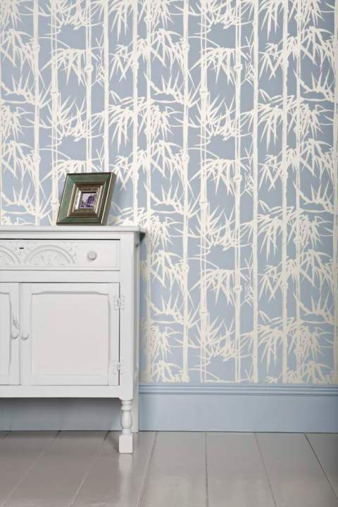
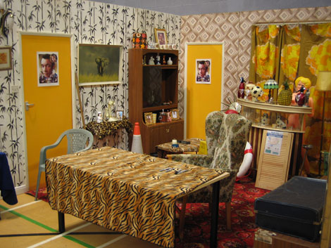
I’m sure I’ve seen this pattern somewhere before. According to the lovely people at Farrow & Ball, the Bamboo Papers are inspired by an iconic 19th century Japanese print, featuring bamboo as a symbol of good fortune. But I’m not so sure. Think back, all ye wise interior design experts, to the Peckham flat belonging to Del Boy Trotter in TV sitcom, Only Fools and Horses. It’s a gallimaufry of retro patterns and sickly seventies colours, and with the plastic pineapple ice cube bucket and red pub-style carpet, it’s about as far away from Farrow & Ball style-wise as it’s possible to get – but look to the left feature wall. Case closed. – Ellie
Filed in Decorating and interiors, Stylish shopping
Tags: farrow & ball, farrow and ball, feature wall, ideas for living room, paints, retro, the bamboo papers, wallpaper


